

Table of Contents
An Improvement to the Teams Client User Interface
People have been complaining about how easy the Teams client user interface (desktop and browser) makes it to create new topics instead of posting replies to existing conversations. Signs that something might be happening to improve matters came in a tweet last month from the Teams development VP, covered in another article.
Fast forward to today, and news from Microsoft is that “the journey to reducing dangling replies” which started in early 2018 is reaching an important point with the roll-out of a New conversation button to all tenants. The roll-out has already started and should be complete worldwide by the end of next week.
Introducing the Conversation Button
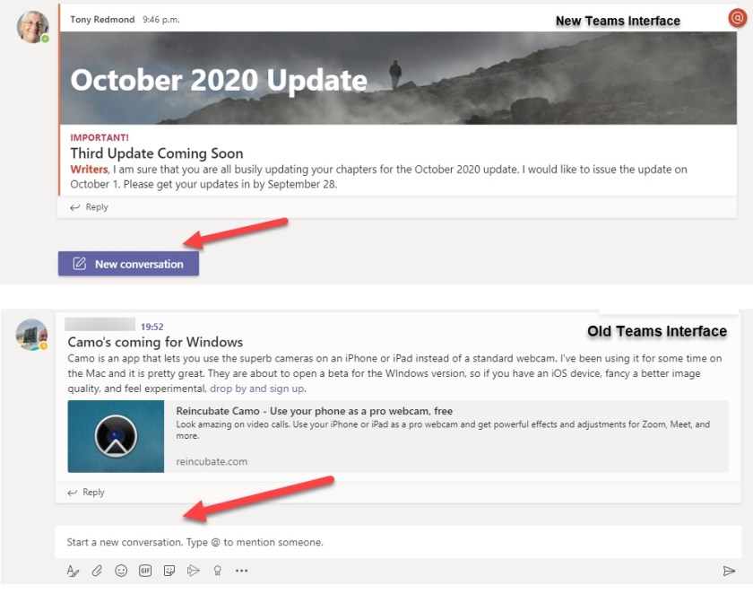
Figure 1 shows the difference. At the top, you can see a topic with the new button in full view. It’s much more obvious how to start a new topic as opposed to a reply to the last topic. The bottom screenshot shows the old interface. You can argue that it’s still obvious how to “start a new conversation,” but the evidence is that many people mixed up replies and new topics when they responded to a conversation, leading to the infamous dangling replies (not connected to a topic), and a chaotic list of posts that made it harder for Teams users to find the information they want.

Important for Compliance Too!
Apart from the aesthetic irritation caused by dangling replies, it’s important from a compliance perspective that the replies to topics are linked together as this makes it much easier to reconstruct conversations. Investigators can reassemble conversations from individual messages but it’s much harder when messages do not share the same thread identifier and are therefore not linked. Microsoft tools like advanced eDiscovery present complete conversations by using the thread identifier, which can’t happen for dangling replies.
Ending Dangling Replies
Of course, users won’t care about the plight of compliance managers and investigators. Nor should they. Software interfaces should be clear and intelligent enough to help people take maximum advantage of applications, and Teams failed in this respect. Hopefully, the new button will lead to more coherence, less chaos, and few dangling replies.
You might not think that the team writing a book like Office 365 for IT Pros would be interested in a tweak to a client user interface. The compliance issue explained above is why we think this is important. You’ve got to think about things from multiple angles!